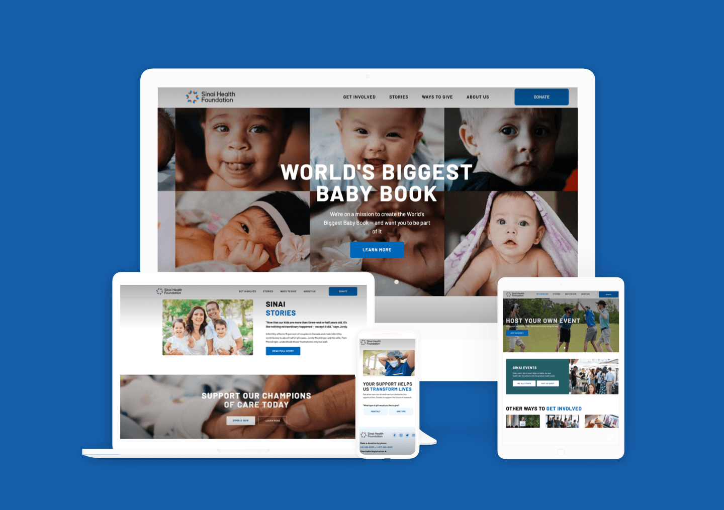
Redesigned and developed the current Sinai Health Foundation website from the ground up, improving the donation flow and overall site experience, particularly on mobile devices.
visit live site →When creating this new marketing website for Sinai Foundation, a lot of effort was focused on making the site responsive, legible, and easy to navigate. The majority of our time in creating this was spent mapping out the user flows, and creating detailed information architectures that we could present to the team. Creating site maps also was extremely helpful as there were dozens of pages that needed to be moved or revised and it helped having a living guide for us to go by.
The biggest focus of this project was improving the user experience for a donor. Before donors had to go through many different pages just to get to the donation area. We worked hard to streamline this process as you can see in the third screen below and offered a clean, simple design for the optimal user flow.
Another big focus on the site was the ability to easily book events, something that the old site did not have. You can visit the events page here and check it out yourself.